“As Japanese rice traders discovered centuries ago, investors’ emotions surrounding the trading of an asset have a >major impact on that asset’s movement. Candlesticks help traders to gauge the emotions surrounding a stock, or other >assets, helping them make better predictions about where that stock might be headed.
– Cory Mitchell on Investopedia.com
At any given time, just a few candlesticks can tell you the net emotional response of buyers versus sellers on the entire market. It’s a binary game. Either you sell or buy. This is why algos are so prevalent. But the algos are not AIs, yet. People like us, the passive traders, can react to the active traders. Active traders move markets due to their financial liquidity; they have the big bucks and influence. We, passive traders, don’t need to know what they are thinking. It’s impossible to do so. It’s not a poker game, where you can read tells. Everything we need is readily available to anyone with a computer and internet connection. We are here to just look at the chart and react. The chart has all the data you need for a passive trader. It implies that everything is always priced in at any given time. We don’t care about what type of catalyst moved the market, for example: politics, social media icons, natural events, world leaders, feds, banks, etc… Well, I guess the world’s largest EMP blast could do the job. But just knowing I don’t have to be constantly up-to-date with news or what anyone is saying about the market feels liberating.
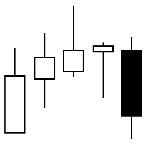
Let’s start with the basics. Two major types of charts I care about: the candlestick time chart and the tick chart. A new bar is formed every time a set amount of transactions are executed in a tick chart (e.g., 5000 tick chart = 5000 trades per bar), unlike a time-based chart, which creates a new bar based on a fixed time interval (e.g., 4 hourly candlestick time chart = all the trades on a bar within 4 hours). I use tick charts, because I find them cleaner when it comes to showing us buyer/seller’s emotions behind the chart. Most bars have a line coming out from each end (these lines are called wicks). Each bar shows us an emotion that can be interpreted differently over a period. Figure 1.0 shows emotion by visually representing the size of price moves with different body colors (white and black). A candlestick shows us 4 data points in a given timeframe: high, low, open and closed price for any given timeframe. Shown below in figure 1.0, we have a bull and bear candlestick.

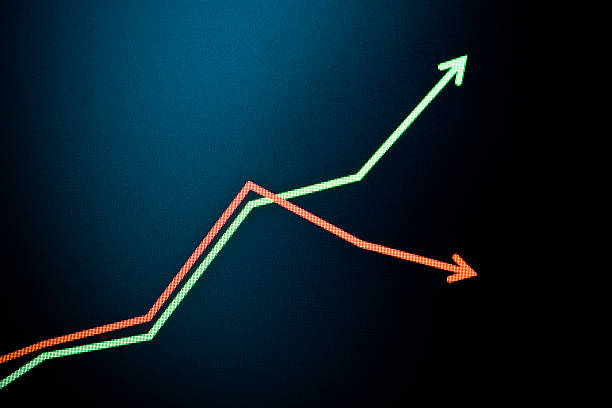
Candlesticks help us read momentum; whether there is more buying or selling pressure and how large or small is that pressure. For this example, let’s look at figure 4.0: White candlestick had more buyers than sellers. So, within the 4 hour time period, it closed higher than when it opened. The next 4 hours, the market had more sellers than buyers. You can even argue that between the total, 8 hour, timeframe, there were more sellers than buyers, because we ended up closing below where we opened. That tells that the market is bearish given the context provided us in figure 4.0. Reading multiple candlesticks and viewing them from multiple timeframes allows us to tell us one of the biggest concepts every trader must know: trend. Are we going up, down or sideways? It is then that we can even begin to think of our trading plan. In figure 4.0, we were on a downtrend the second we closed below the white candlestick. Once you get good at reading multiple candlesticks (price action movement), you are able to react accordingly. Let’s take a look at very common patterns you will encounter. All traders need to understand these basic candlesticks before moving on to more complex setups. Also, a reminder that these patterns are describing the current emotional read of the market. So, it doesn’t mean that if you see these patterns, you immediately know what’s going to happen next. All this is to describe what has already happened.
A bearish engulfing pattern develops in an uptrend when sellers outnumber buyers. This action is reflected by a black real body engulfing a small white body. The pattern indicates that sellers are back in control and that the price could continue to decline. Notice from left to right, the white bodies are getting smaller and smaller. This tells me that as price was increasing, we saw less demand from buyers. If no one is buying it, eventually, the sellers will be in control of the market due to demand being over bought. Refer to the figure below in 4.2

All I want you to understand from that chart: Low demand, high supply: the item sells for cheap. High demand, low supply: the item sells for a fortune. Supply matches demand: the item sells for what’s considered a normal price at that time.
If there is an increase in supply for goods and services while demand remains the same, prices tend to fall to a lower >equilibrium price and a higher equilibrium quantity of goods and services. If there is a decrease in supply of goods and >services while demand remains the same, prices tend to rise to a higher equilibrium price and a lower quantity of goods >and services.

If you were to guess what a bullish engulfing pattern looks like compared to a bearish engulfing pattern, you would be right, they are equal and opposites. An engulfing pattern on the bullish side of the market takes place when buyers outpace sellers. This is reflected in the chart by a long white body engulfing a small black body. With bulls having established some control, the price could head higher. This one in particular shows a very strong bullish engulfing pattern due to how large the white body is compared to two previous black candles. This tells me we are either about to retrace or reverse. For now don’t worry about the difference between retracement and reversal. Just know why it’s called a bullish engulfing pattern.
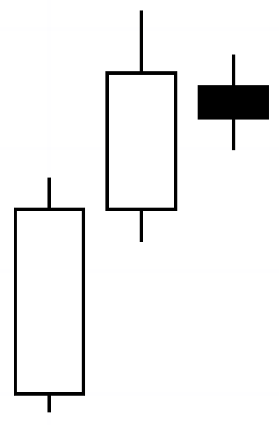
A bearish harami is a small real body (black) completely inside the previous day’s real body. This is not so much a pattern to act on, but it could be one to watch. The pattern shows indecision on the part of the buyers. If the price continues higher afterward, we call it an uptrend continuation (don’t worry what that means right now), but a down candle following this pattern indicates a further slide on the downside. The opposite is true for a bullish harami.

An evening star is a topping pattern. For this example, it is identified by the first black candle we see that opened above the first two white candles. The first black candle also closed inside of the previous white candle’s body. It wicks higher than the previous white candle’s high as well. The last candle closes deep into the real body of the candle two days prior. The pattern shows a stalling of the buyers and then the sellers taking control. More selling could develop. Not will but could. Knowing this little information tells you more about trends. The opposite is true for a bullish evening star. Okay so enough random patterns. We don’t give two shits about memorizing and learning arbitrary patterns that don’t always guarantee the next move in the market. It is more important to know why these patterns are formed, because it drives the narrative of how you will read price action once done going through this course.
When I first learned about what each candlestick represents compared to the last candlestick, I found several articles on investopedia.com that were written by Cory Mitchell. He has been a professional day and swing trader since 2005. Cory is an expert on stock, forex and futures price action trading strategies. Without knowing these fundamentals, I wouldn’t be able to talk about the next biggest and most important topic when it comes to trading: trends.
Trend
So far we have been talking about trend without you guys realizing it. Trend can appear in many forms, but to understand where trend starts and stops, it will put you ahead of the curve. Trend is your friend. A trend is the overall direction of where an asset’s price is headed. In technical analysis, trends are identified by how price action behaves. If price action is producing higher highs (HH) and higher lows (HL), it’s ‘driving’ an uptrend. The same is true vice-versa. If price action is producing lower highs (LH) and lower lows (LL), it’s driving a downtrend.
Shown below in figure 4.7 is a weekly chart from 2004 to the infamous S&P 500 index around Obama’s first presidential election.

Chart above indicates an uptrend line shown in green color. Notice during the uptrend, price is respecting the general area of the green trend line. As well as, we can see price action forming HH and HL throughout the years. Each time price action forms a HH, the previous HH now becomes support. Each time price action formed a HL, it is ALWAYS formed above the previous HL. The opposite is true when price action is on a downtrend.
Trend lines are always diagonal. The horizontal lines are called “levels”. A level is a specific price point where price action changes its behavior based on the context of the level. All it takes is 2 or more candles to form a level. We will talk more about how to draw levels in the next couple of chapters. For now, below shown in figure 4.8, the green diagonal lines are trend lines, while all the horizontal black lines are important levels that help us determine when and where we buy, sell, take profits, or determine valid stops. Drawing levels is the easy part. Determining how to use these levels to your advantage is the hard part since most professional traders will have similar levels as you do.
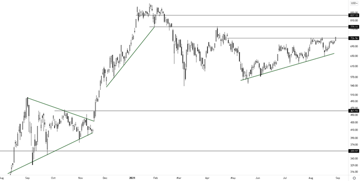
All you have to know for now is how trend lines are usually drawn. Chart above shows a best fit green trend lines drawn near the extremes of price action. For now all we care about is how to draw a proper trend line. It’s very simple so far right? One can almost take a trade near these extremes multiple times and get away with it until they don’t. This is usually how people end up blowing up their accounts that only trade trends with no stop losses. Eventually, the trend will fail and the price action will go the opposite direction of their liking. We kind of saw that in figure 4.6 – near the end of 2007 and beginning of 2008. The uptrend line was being “respected” (price action doesn’t go too below the line), until a major breakout occurred near the end of 2007, where price went down for the first time below the last HL shown below in figure 4.8.
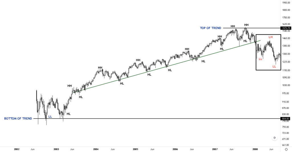
Figure 4.8 shows that for the first time since mid-2003, the $ES_F disrespected the trend line by forming LLs and a LH indicated in the rectangle. So does this mean that we can call 1573.75 the top of this trend? Will the candlesticks close below 804? Will it close somewhere above 804 and then continue higher than 1573.75? These are the types of questions you should be thinking about right now. Part of being a trader is knowing what past price action behavior means relative to what is shown in the present moment. It’s always about context. The chart shows both present and past. We can easily react to different scenarios that can happen. For example and without getting too much into detail, I see 3 good trades I can take if someone gave me only figure 4.8 and nothing else: a short trade around $1,400, another short trade at 15730.75, or a long trade around $850. There are way many more trades I can take, but why take them if the odds come down to 50/50? I would rather go to the casino and bet on roulettes. These 3 trades: I’m 75% – 90% sure they will go in my favor. I came up with this range of probability due to the 4 times I’ve back tested this strategy (total trade samples of 400) and due to being funded 4 times. I call these types of trades: “initial reactions”. We will talk about what qualifies an initial reaction trade in chapter 6. Just know, the best traders I know, ALL, commit to these types of trades ONLY. It’s simply due to simple statistics and human psychology that consistently appears in the market. All you need is a computer and charting software.
Every trend has a base and a top. Therefore, every trend has a range of “trend base levels” and a range of “trend top levels”. Most professional traders only take trades at these ranges due to providing the highest probability of a successful trade. If you understand just this concept, which is explained in chapter 6, you will be in the 99th percentile group. All professional traders I’ve known understand this concept in their own way. Before we get into it, we need to understand how support and resistance are created and lost through technical analysis and psychology.